

At HyperTrends, we are dedicated to crafting unparalleled user experiences for the SaaS platforms we develop, ensuring every interaction is nothing short of exceptional.
Our commitment to delivering top-notch customer experiences isn’t just a promise—it’s our brand’s hallmark.
If your users aren’t left with a “WOW” effect when navigating your system, then we haven’t done our job right.
A key component of our strategy is empowering users with easily accessible, actionable data throughout the platform.
This approach, which we proudly call the “360-degree Data View” pattern, is at the heart of our design philosophy.
It’s not just about data visibility; it’s about making every piece of information readily available and intuitively actionable, driving engagement and satisfaction to new heights.
360-Degree Data View
The 360-degree Data View pattern revolutionizes the user experience for sophisticated SaaS platforms by making interactions seamless and intuitive. Our custom software and SaaS platforms leverage multiple microservices, transforming complex subsystems into a smooth and cohesive user journey.
This pattern is anchored in a few core principles:
- Proactive Data Delivery: Important information is pushed to the user, eliminating the need for them to hunt for it.
- Holistic Data Perspective: Users receive a comprehensive view of their data, rather than fragmented snippets.
- Effortless Additional Actions: With just 1-2 clicks, users can access all relevant data, streamlining their workflow.
- Interconnected Data Access: Integrated systems clearly convey the impact of data across the user interface.
Let’s delve into each of these principles in more detail.
Proactive Data Delivery
Facebook has perfected this approach with its feeds and notifications system. We strongly advocate for this pattern as well.
When we developed a SaaS platform for a fitness franchise, we prioritized data notifications for critical events. This included:
- Incoming SMS messages, integrated seamlessly with Twilio.
- Membership change requests.
- Pause subscriptions.
- Failed payments.
- and more…
By pushing these notifications directly to users, we enable them to focus on immediate, important tasks instead of searching for critical data.
Figure below shows an example of this concept:
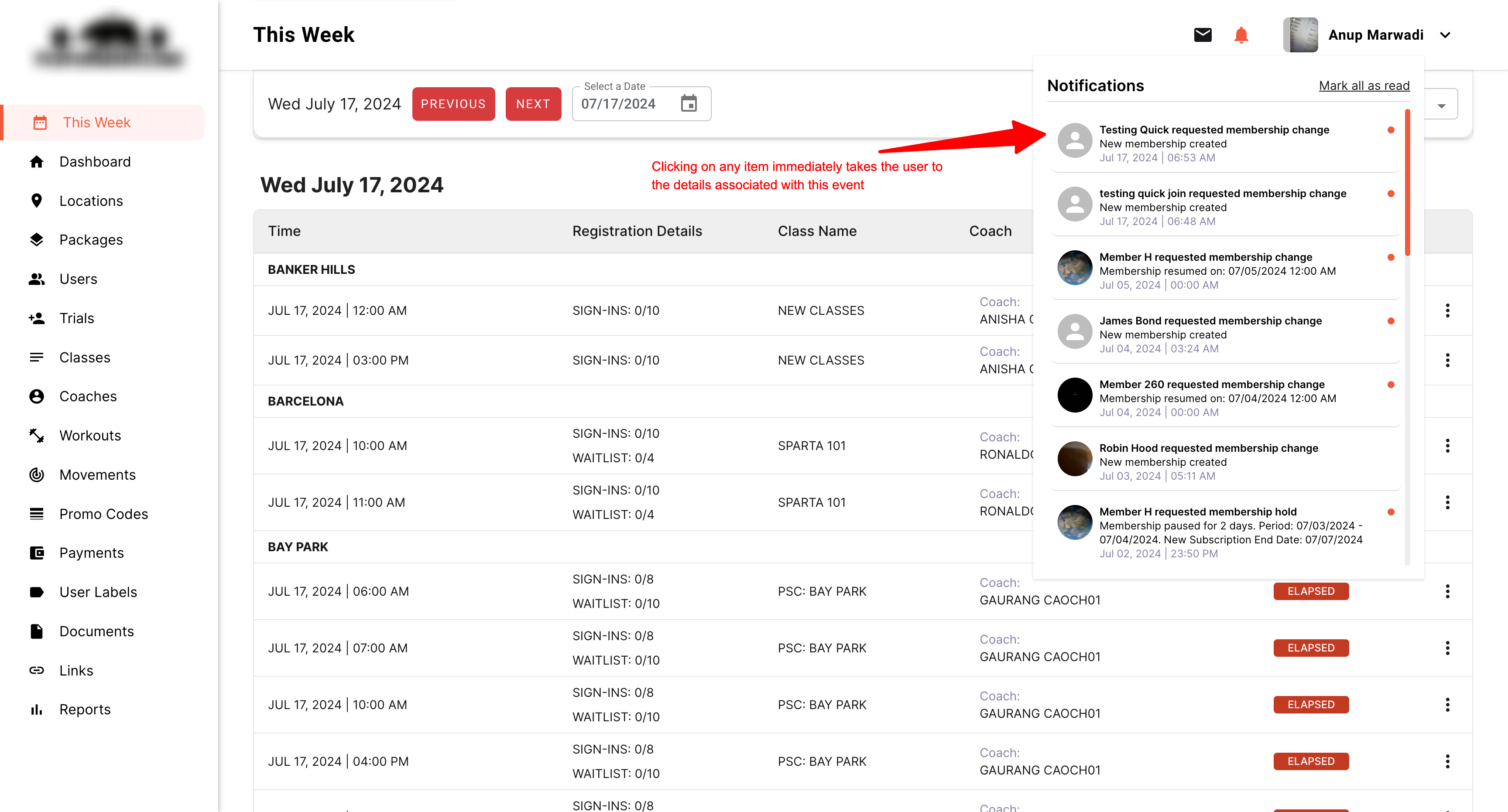
Building a notifications system might seem straightforward, but it involves numerous intricate elements. In fact, entire businesses are dedicated solely to solving this problem efficiently.
At HyperTrends, we take it even further. We have developed a multi-tenant, white-labeled notification architecture that can be leveraged across various platforms, ensuring seamless and efficient data delivery.
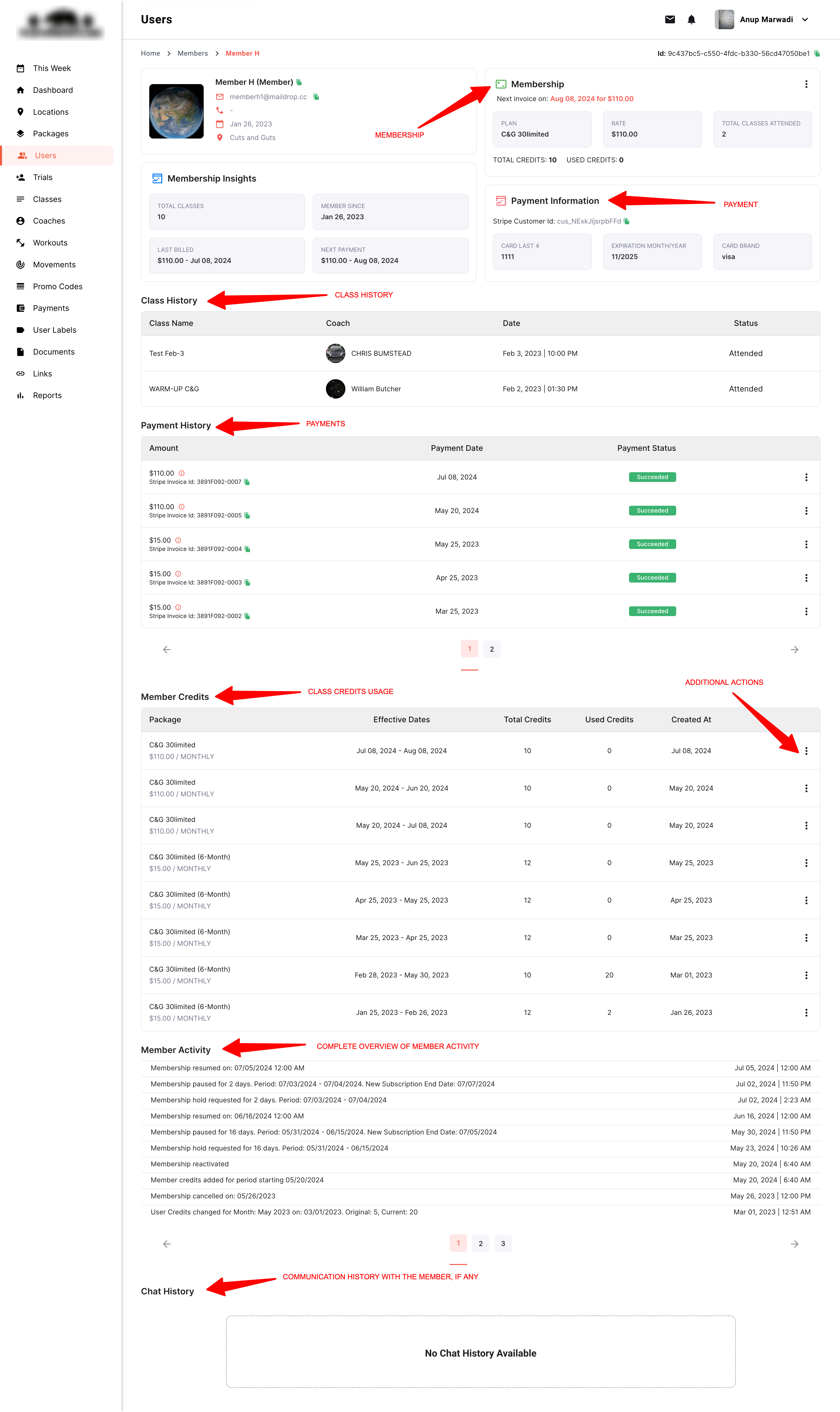
Holistic Data Perspective
When a user decides to view specific data, it’s crucial they see it holistically.
For example, if I’m reviewing a user’s information, it makes sense to see everything related to that user in one place.
The figure below illustrates a User’s Detail screen. We consolidate almost all information associated with the user into a single screen, enabling quicker, more informed decision-making.
This single screen provides administrators with everything they need to know about the user.
Additionally, we display specific information based on access levels, ensuring that only authorized users can view certain details.
Effortless Additional Actions
The third key aspect of our design is ensuring additional data is accessible within 1-2 clicks. Anything more complicates the process and burdens the user.
Using the example above, we provide easy access to actions such as:
- Change Memberships
- Cancel Membership
- Suspend Account
- Assign Labels
All of these actions are available from a simple context menu, streamlining the user experience.
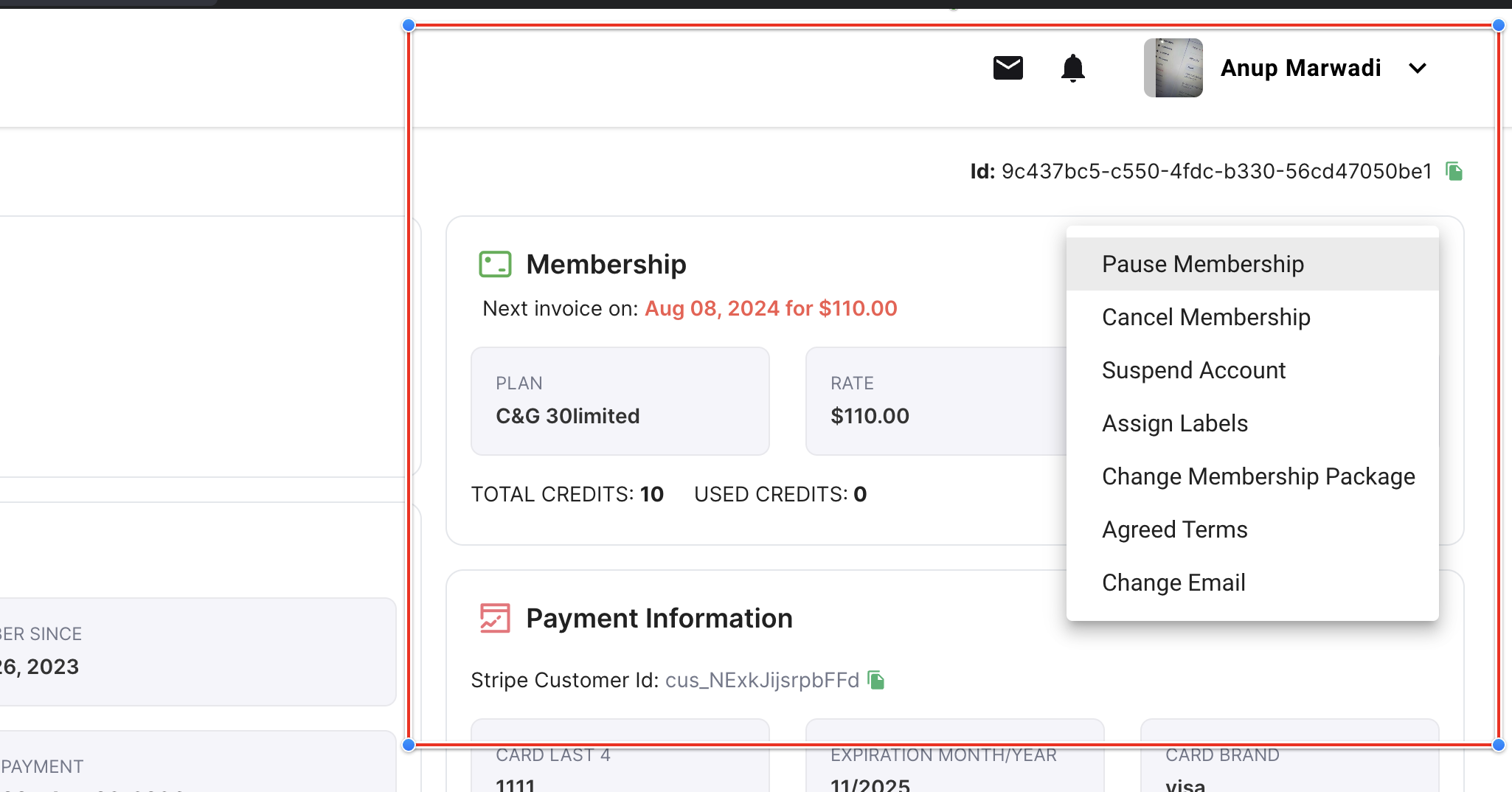
The user can drill down the rabbit hole without leaving the current screen.
For example, here’s what “Assign Labels” looks like:
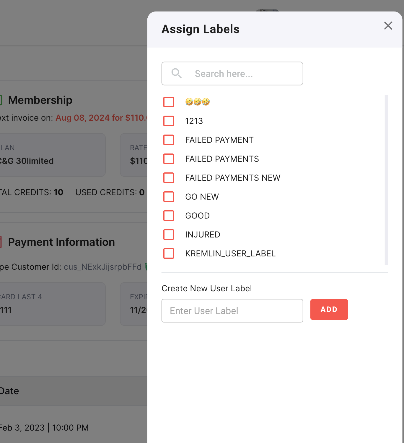
Providing users with experiences like these make the overall platform appealing and easy-to-use.
Interconnected Data Access
Not all user data resides within your own systems. For instance, much of our SMS chat history data comes from Twilio.
It’s crucial to pull this information seamlessly without exposing the end user to this complexity. Users shouldn’t need to know where the data originates; they only care about accessing it easily and interacting with it smoothly.
Here’s an example of an entire conversation with a guest via the Twilio system. The user remains unaware that this data is pulled from an external service, experiencing it as if all messages are within the same platform:
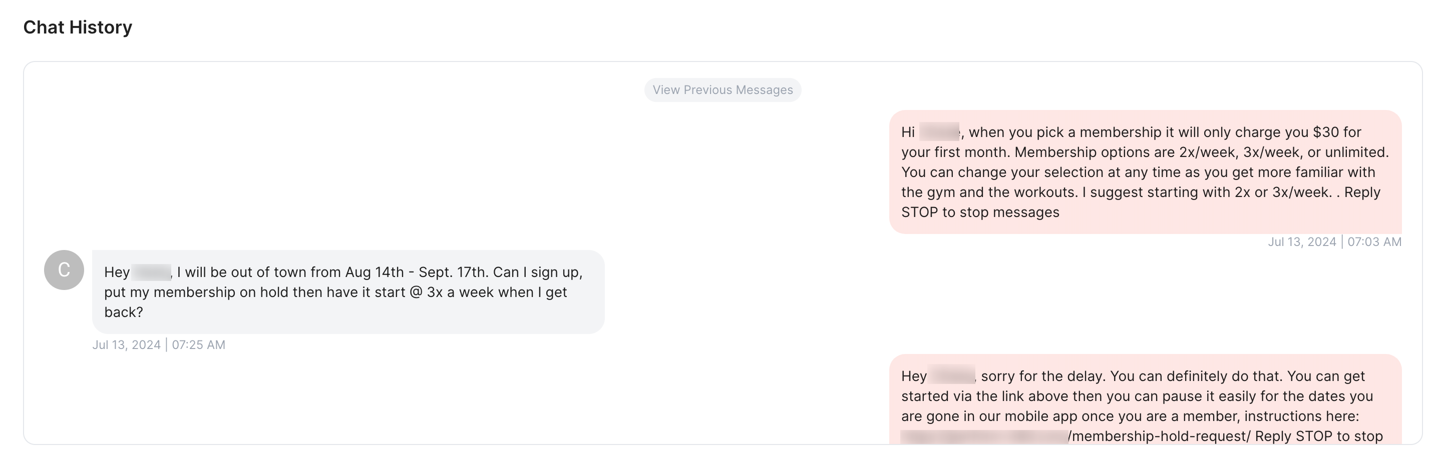
Offering such a cohesive user-experience is a hallmark of a system built well.
Conclusion
So there you have it. A great UI/UX pattern that will help you scale your SaaS platforms significantly and achieve very high user-satisfaction rates.
If you’re looking to build amazing SaaS platforms, schedule a free consultation with us. We have assisted hundreds of customers build world-class SaaS User-Experiences and would love to have a chat with you.